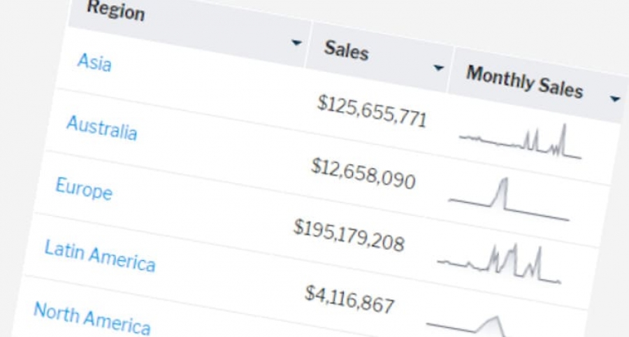
You can do that inside a table column with tiny charts called sparklines. Sparklines is the perfect solution for visualising tabular data with the idea of placing the visualisations ‘in-line’ with the other data.
The example below will take you through the steps to create a sparkline on metric data in your tabular report.
Create a new report based on the Ski Team view.

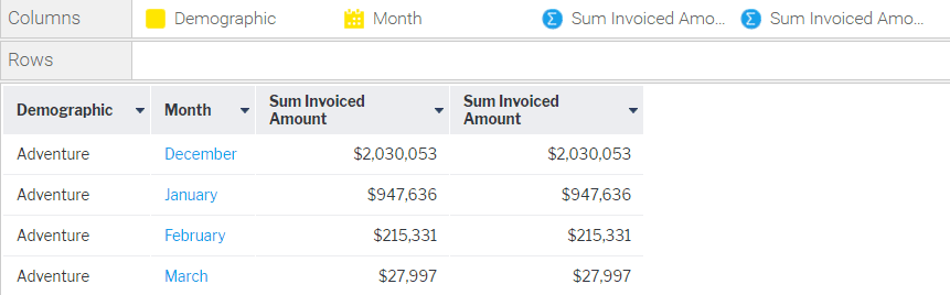
Add the Demographic and Month fields into the Columns area. Add the Invoiced Amount field twice.
We’ve added two copies of the Invoiced Amount field in order to apply an Advanced Function to one of them.
Open the field menu of the first Invoiced Amount field and select Advanced Function.

In the Advanced Function popup, select the Analysis function type. Then choose Sparkline Array Analytic Function from the list of functions.
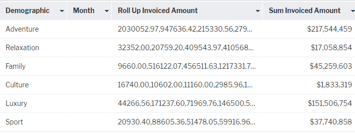
Choose the Month field for the Date Field attribute. This field will be used to aggregate the Invoiced Amount values to create a comma separated list. Note that it will appear blank in the report table, as the Invoiced Amount metric now represents data from multiple dates. You can also hide the blank date field. The rest of the rest of the settings can be left unchanged.

You can also specify how the missing values in the date field should be filled and whether or not to use a scaling value for the sparkline.
Click Save.
You will notice that the Month field is now blank, the Invoiced Amount column was renamed to “Roll Up Invoiced Amount” and the value was changed to a comma separated list of values, one for each month.
Open the Column Formatting menu.

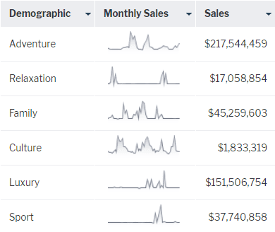
Select the Month column, and hide the column using the Show Field toggle box.

Select the Roll Up Invoiced Amount column, rename it to ”Monthly Sales” and change the format to SparkLine Formatter. This will convert the values into sparklines.

You can also specify the width and height of the sparkline.
Rename the Sum Invoiced Amount column to “Sales”.

Close the Column Formatting popup to view the sparkline in the tabular report.
Publish the report.