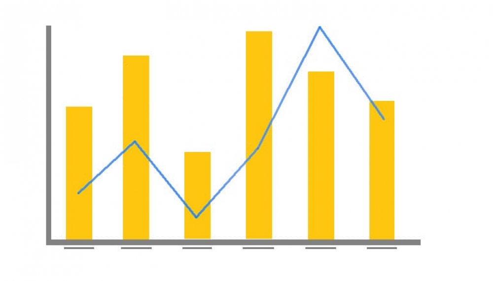
This problem is solved by the Combination Overlay Chart.
Combination Overlay Charts can combine two or more different charts to make one (see screenshot below). It will also allow us to plot each of the values on a different axis – this is useful when the numbers on your chart vary widely from data series to data series or when you have mixed types of data, for example Sales and Number of Camps. A Combination Overlay Chart lets you use either lines, bars, or both to visualize your data.

In this article, I will guide you on how to create a Combination Overlay Chart to compare the total sales per year with the number of camps for that year.
Create a new report based on the Ski Team view.

Add the Year, Invoiced Amount, and Camp ID fields into the Columns area and disable Drill Down.
Apply a Count Distinct aggregation to the Camp ID field.
This will allow you to see how many camps you had per year, and then compare that figure to the total sales for the year.
Format the metric fields so they are named Invoiced and Camps.
This will mean that the names are displayed nicely in the combination chart.

Proceed to the Charts step.

Select an Overlay Chart from the Combination Charts group.
This chart will allow you to display multiple metrics on the same chart, while using two different scales in order to compare metrics of very different proportions.

Add the Year field to the Horizontal Axis area, and the Invoiced and Camps fields to the Vertical Axis area.
You will now have what looks like a column chart. At the moment, due to the fact that the size of the two metric fields are vastly different, you will only see the Invoiced columns, the Camps columns will be too small to appear on the same scale. This is why we will be adding a secondary axis in the coming step.

Open the Combination Charts menu. Change Chart 1 to be a Line and enable the use of a Secondary Axis.
The first chart appears in front of the sub charts. Therefore, it’s recommended to make the line chart the first chart.

Add a sub chart. Set the second chart type to be a Bar.

Open the Series menu, select the Invoiced metric, and change the Combination Sub chart option to be Chart 2 (Bar).
Once you’ve enabled the second chart, you will need to assign a metric field to it, at the moment both metrics are still using the first chart, with the first vertical axis.

While still in the Series menu, select the Camps metric, set Shapes to Yes and change the Thickness option to 2.

You will now have a Combination Overlay chart. The only issue is that the user has no way of knowing which metric belongs to which axis.

Open the Axis menu. Set the Vertical axis Display Name to Invoiced and the Secondary Vertical axis Display Name to Camps.
You will now see labels on the axes which match up to the chart legend, letting the user know which metric belongs to which axis and which scale.


